Architecture Classics: Marina City / Bertrand Goldberg

© Flickr User: TRAFFIK [US

Along the eastern branch of the Chicago River lies one of the most formally interesting skyscrapers in all of Chicago, Marina City by Bertrand Goldberg.  Completed in 1964, Marina City, at the time, was the tallest residential projects in the world and still remains one of the densest inhabited developments.  Unlike any project before it, Marina City was an experiment of allocating diverse programs into a “city within a city.”  Although, it is not as widely recognized as the Sears Tower or the John Hancock Building, Marina City’s distinctive “corn-cob” shape has a strong presence among modern architecture, as well as Chicago’s skyline.


In 1959 when Bertrand Goldberg was commissioned for the project, he had no prior experience designing at such a large scale; he mainly worked on smaller scale residential and institutional projects.  However, the developer, William McFetridge, president of the Building Service Employees International Union, entrusted Goldberg to design a complex that would slow Chicago’s urban exodus. At the beginning of the 1960s, those that lived in the city were growing tired of the dense, overcrowded conditions and had taken “flight” to the suburbs for a more open and accommodating way of life.  Marina City was an attempt at combating and reversing the flow of people back into the city, so close to the Loop.  It was a model of efficiency and convenience for modern living in a metropolitan area.

© Bert K

Goldberg thoroughly believed that people wanted to live in downtown Chicago.  His approach to Marina City was to design a “city within a city” that could fully accommodate people’s everyday needs and activities just a short distance from their homes. It was a method of bringing suburban commodities and ease of access to an urban setting.

At the time Marina City was completed, it was a programmatic treasure trove consisting of a theatre, gym, swimming pool, ice rink, a bowling alley, stores, restaurants, and a private marina for the residents.  All of these amenities were just a few of the measures taken to emphasize that everything one can find in the suburbs is available in one small urban area.

Goldberg’s design of Marina City is the first of its kind for a mixed-use residential project. The buildings programmatic complexity and unparalleled formal aesthetic creates a unique presence among Chicago’s skyscrapers.  Over the three acre site, two cylindrical residential towers bring urban living to a new found height.  The two reinforced concrete towers are designed around a 35’ diameter structural and vertical circulation core that allow for an egalitarian distribution of residential units on each floor. The cylindrical tower design creates 360° views of the “Second City,” while also serving as a structural stabilizer against the strong Chicago winds.

© Vincent Desjardins

Each tower incorporates a spiral parking garage on the first nineteen floors. It is one of the first non-enclosed parking garages ever incorporated into the design of a residential high-rise.  The 20th floor of each tower serves as unit storage and laundry services for the residents.  The remaining forty stories of each building offer approximately 450 units; offering a total of 900 units categorized by studio, one bedroom, and two bedroom units.

The units themselves give Marina City its distinctive features; each unit has a balcony that defines the formal “corn-cob” aesthetic.  Because of the rhythm of the façade and standardization of the units makes the tower seem as a simple design gesture.  However, each floor contains a different type of dwelling unit so that no two similar floors are repeatedly stacked on one another; making for an interesting spatial juxtaposition in regards to the balcony. The wedge shaped units blossom from the core towards the city offering up uninterrupted views of the city.  Every unit is especially unit in that there is not a single right angle in any unit.  The lack of hard edges and sharp corners opens up the plan of each unit flowing from one space to another with ease.

© Flickr User: moaksey

Today, Marina City still features most of the original program from when it was completed in 1964.  The entire complex has been transformed for more contemporary uses; the auditorium/theatre has been converted into the House of Blues, adjacent to the residential towers is the Sax Hotel, and above the marina is an upscale restaurant Smith & Wollensky, while the units have been converted into luxury condominiums making it one of the most sought after residences in all of Chicago. Marina City sits as a modern architectural icon along the Chicago River serving as precedent for contemporary practices of cross-programming and dense urban development, as well as gracing the diversely, magnificent skyline of Chicago.

Architect: Bertrand Goldberg
Location: Chicago, Illinois, USA
Project Year: 1959-1964
Photographs: Vincent DesjardinsFlickr User: Vicious BitsZach EversonFlickr User: TRAFFIK [US]Bert KFlickr User: moakseyFlickr User: reallyboring
References: greatbuildings.commarinacityonline.comgalinsky.com

Kroll , Andrew. “AD Classics: Marina City / Bertrand Goldberg” 11 Nov 2010.

Leave a comment

Filed under Architecture Categories, Residential, Skyscrapers

Architecture Classics: Lloyd’s of London Building / Richard Rogers

© Andrew Kroll

After the completion of Centre Pompidou in 1977 with Renzo Piano, Richard Rogers was commissioned to design a new building to replace the original Lloyd’s insurance building inLondon.  It would be the second expansion in the history of the company’s headquarters due to the overcrowded conditions of hundreds of people working with international insurance cases.  Completed in1986, the Lloyd’s building brought a high-tech architectural aesthetic to the medieval financial district of London that was previous implemented in the design of the Centre Pompidou in Paris.

Since 1928, the site has been home to the Lloyd’s of London; one of the largest insurance firms in the world dating back to the 17th Century.   After it originated in the 17th Century, the Lloyd’s of London has grown from an insurance company dealing from within the United Kingdom to working on a global scale, taking on staff and clientele at an unprecedented rate, which has required several expansions; the largest and most prominent being Roger’s.

© Greg Kristo

Similar to Centre Pompidou the Lloyd’s building is designed “inside out.” All of the service functions are removed from the interior and placed at the exterior of the building.  This not only allows for easy replacement and maintenance on the elevators, plumbing, or electrical facilities, but it frees up the interior to create an open and flexible plan that allows for uninterrupted activity on each level.  With the open spatial planning, the interior is capable of being reconfigured on a moment to moment basis with partition walls that can subdivide each floor and create new and interesting spaces.

© Mark Ramsay

The Lloyd’s of London building consists of three main towers-each attached to their own service tower-that are concentrically oriented around a 60 meter atrium at the heart of the building.  Each floor acts as a gallery overlooking the atrium; however, only the first four floors are open to the atrium whereas the rest are enclosed by glass panels.  Throughout the atrium, there are a series of escalators cutting across the void to create an interior circulation that links the floors of the underwriters adding to the dynamism of the space.

When Roger’s took on the project, it required the demolition of the original 1928 building, but rather than completely demolishing all traces of history for the Lloyd’s of London, he retained part of the original façade as an homage.  The historic architecture of the past juxtaposed to the high-tech style of the new Lloyd’s building seems almost contradictory and forced, but the two styles seem to coexist in a manner depicting the modernization of London.

Besides the mechanical and circulatory systems being placed on the exterior, the façade of the Lloyd’s of London building is not contiguous in the sense that it appears to be a “kit of parts,” where interior spaces seem to be modular.  Its seemingly compartmentalized façade reinforces its modularity in the plan, but is visually more apparent in the elevation.

© Greg Kristo

The entire building is wrapped in stainless steel giving the building a high-tech, almost post modern, aesthetic.  The streamlined façade juxtaposed to the mechanical and service functions on the exterior evoke the technological advances of its construction, as well as express the building’s main focus on functionality.  The aesthetic appears to have an almost unfinished quality to its construction; Roger’s even left the cranes from the construction on the top of the building as a decorative feature to the building, but their presence suggests insight into the modern aesthetic as well as creating a place for the Lloyd’s of London building within architectural modernism.

Architect: Richard Rogers
Location: London, England, UK
Project Year: 1978-1986
Photographs: Greg Kristo, Andrew KrollMark Ramsay
References: greatbuildings.comwikiarquitectura.comgalinsky.comemporis.com

Kroll , Andrew. “AD Classics: Lloyd’s of London Building / Richard Rogers” 21 Nov 2010.

2 Comments

Filed under Architecture Categories, Industrial, Skyscrapers

Vertical City / Desitecture

Courtesy of 

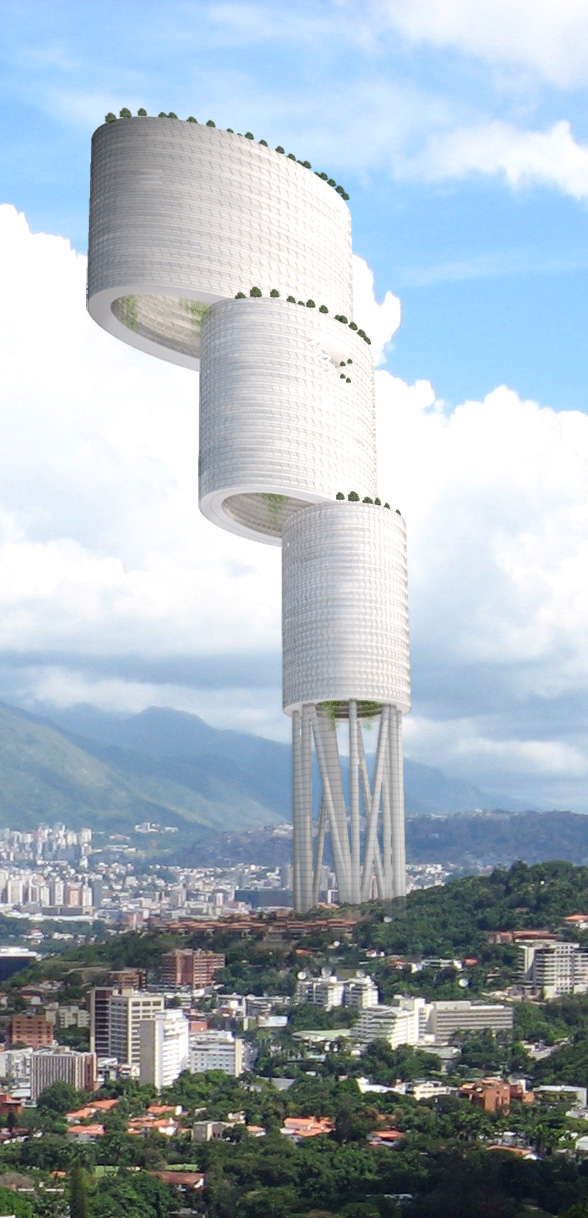
Desitecture, a British Architecture Collective, have recently been shortlisted by the World Architecture Festival in the future project-experimental category for their Vertical City in. More images and architect’s description after the break.

Courtesy of Desitecture

Originally 23 de Enero was designed to become a mass housing block for residents of the city to live and work in. On January 23rd, 1958, when the dictator President Jimenez was ousted following a military coup, masses of homeless and lower class citizens flooded into the tower and it has since become known as 23 de Enero.

To cope with the threat of eviction, the residents became more organised and networks of exchange and communication formed within the towers which became self contained micro communities.

Courtesy of Desitecture

The social imperative – without ownership the disenfranchised poor cannot hope to bequeath a viable inherited financial future to the next generation, their children. In order that they are able to have a capital stake in the exiting societal construct they must have ownership of the land on which they live, to this end the tower acts as a catalyst for the creation of ownership. As the land on which the tower is constructed, is that of the barrio, this gives value to previously worthless land. The stakeholders now have options either to move out of the favela and reside in a new unit within the tower in its emerging micro economic community whilst deriving an income from their share in the land development or to relocate altogether, somewhere new. Although this would have the effect of breaking up the established community, it could open up new social and economic connections.

Courtesy of Desitecture

The reclaimed land and would now become available for commercial /intensive agricultural development and would a new enhanced economic value, thus providing a legacy for the re located former inhabitants. The tower releases land, provides work and acts as a negotiator for an engagement with capital. The city gains a new quarter providing fresh produce and enhanced transport links and facilities, to a new economic zone.

Courtesy of Desitecture

The social identity
The three cups, define distinct user groups and activities, which are nonetheless related, typically they could contain college level activity, university and research / knowledge economy business; or retail, hotel, apartments; or social housing, local administration and offices .In whichever configuration, the tower is a metaphor for true urban living, having all the elements of work, leisure , home and a sense of place in one entity, Access to and from the tower takes many forms, cable car, helicopter, water taxi car or metro.

Bars, café’s and restaurants should flourish in such a climate, taking as their cue many roof / mountain top venues. The tower, it is hoped, will become a destination in its own right with 24 hr zones of activity; and as such develop a more open culture, and therefore, always be in flux, perhaps even a transient culture, a place to experience.

Courtesy of Desitecture

Structure
The 180 storey tower’s structure bears a strong relationship to the folded spoon analogy, with the bowl being the elliptical lagoon, and the shaft and vertical legs supporting the cups .The tower appears to be a twisting cantilever, but is in fact a simple structure, with only the top cup having a cantilevered element. The main support are the vertical and diagonal structural frame containing circulation and services this runs through all the cups and in the first forty five storey’s supports the palette shaped overlapping gardens and city farms. Beneath the tower are four levels of vehicular access and parking covering an expansive area, which incorporates the piled structural legs and the diagonal main composite core, and grows into the structure of the lagoon, acting as a stabilizing counterweight to the tower .The inner structure of the cups is a diagonal structural grid into which the wheatsheaf pattern of woven individual units is embedded.

Courtesy of Desitecture

The Form
The form of the tower is derived from an inverse of the tower of babel prototype, which is typified by a dense pyramidal structure, instead we have utilized notions of light, air, openness and freedom as the source for a series of aerial streets and courtyards, allowing for the development of distinct lifestyle patterns and communities.

The ellipse favours this approach, the shape allows for four distinct experiential zones, which can be broken down to a local level of organization and inhabitation. The form also minimizes the side effects of wind turbulence often associated with tall buildings.

Courtesy of Desitecture

Construction
The legs / vertical support structure contain elevators and staircases and are linked by structured palette shaped platforms which provide aerial gardens and parks. These parks are also farming units providing an all year round source of food and leisure. each cup has its own external facing park, and internal bridges allow easy access across the inner aerial spaces. Large openings allow additional light into these inner spaces, whilst their hollow nature provides a naturally ventilated core.

Courtesy of Desitecture

Micro climate
The internal elliptical areas provide , distinct micro climates , within each cup, they will each acquire their own character in terms of vegetation and aerial wildlife, supported by balcony gardens and green loading elements which will accrue over time.

Courtesy of Desitecture

Skin
The external elements are of a lightweight composite, precast units contain a hollow structure based on coral which has embedded micro turbines, these make the skin into a wind energy generating surface providing power to augment photovoltaic panel solar collection. Within the inner skin the effect is enhanced as natural convection assists the production of energy.

Courtesy of Desitecture

Night
The building will appear to hover above the landscape creating a breathtaking spectacle in the night sky, it offset elements seeming to be in motion, and offering its users unparalleled views, and a chance to dream.

Cite:

Jordana , Sebastian. “Vertical City / Desitecture” 25 Aug 2010.

Leave a comment

Filed under Architecture Categories, Skyscrapers

Battle over Midtown’s Skyline

© Pelli Clarke Pelli Architects


© Beyer Blinder Belle Architects

New York City’s Empire State Building has dominated its portion of Manhattan’s skyline ever since it was constructed back in 1931.  Now, as Charles V. Bagli reported for the New York Times, a proposed tower just two avenues west on 34th Street across from Pennsylvania Station will be infringing on the Empire State Building as it is slated to rise 1,216 ft – almost reaching the Empire State Building’s 1,250 ft (with its antenna, the ESB measures 1,453 ft). So, it has become the battle of the skyscrapers as the new building claims it will benefit Manhattan by providing jobs and improve the quality of life for New Yorkers and the Empire State Building is worried about losing its iconic presence in the skyline.


The building in question is Vornado Realty Trust’s 15 Penn Plaza designed by Pelli Clarke Pelli, which the City Planning Commission has already approved.  The tower, which will replace the existing Hotel Pennsylvania, would be 56 percent larger than what would ordinarily be allowed to promote Manhattan’s high-density development.  However, Community Board 5, whose district includes the area, does not approve stating that the developer had not provided a rationale for such a large zoning bonus, especially since it did not have a tenant and might not build for years, explained the Times.

Interestingly enough, both sides have produced renderings to support their views.  While Vornado prefers the northern view which shows the towers occupying their own space in the skyline, the view of Midtown from New Jersey shows a different story as Penn Plaza completely blocks the Empire State Building.

Opinions vary strongly over this new building as some ask whether New York’s skyline of earlier years should remain unchanged, or whether we should forge ahead with new structures that could better the city.  Councilman Daniel R. Garodnick told the Times, “The question here is: How close is too close to one of New York’s iconic landmarks.”

David R. Greenbaum, president of the New York office division of Vornado Realty Trust, remarked to the Times,“The fact is that New York’s skyline has never stopped changing, and one hopes it never will,” whereas Anthony Malkin, president of Malkin Properties wants Penn Plaza to be reduced to 825 ft claiming, “It’s all about the iconography of the New York skyline and whether it matters to people or not.”

Cite:Cilento , Karen. “Battle over Midtown’s Skyline” 25 Aug 2010.

Leave a comment

Filed under Architecture Categories, Skyscrapers

Engineered Biotopes / Piraeus Tower 2010 Competition

© Anthi Grapsa & Konstantinos Chalaris

London based architects Anthi Grapsa and Konstantinos Chalaris shared with us their entry for the Piraeus Tower 2010 Competition, for which they gained commendation.


The cities of Attica and especially Piraeus is a city with a very low proportion of open green spaces to the number of its inhabitants compared to European standards.

Our proposal for the Façade reformation of Piraeus Tower intends to use technology for the best possible adaption of nature on the building. Using modern agricultural techniques in the construction of the building we allow nature to flourish with the help of plants and birds that already exist around the city.

© Anthi Grapsa & Konstantinos Chalaris

The program of the facade varies through its vertical expression.

On the outside of the first two floors, the plant nursery consists of a grid of glass tubes used to nurture seedlings. From a distance these appear as a shimmering form, reflecting light onto the street provoking the attention of the passerby.

© Anthi Grapsa & Konstantinos Chalaris

Floors 3-22 consist of small biotopes that produce low vegetation for the workers and visitors inside the building. This system consists of a robotic crane and specially designed modules where plants are grown. The crane is connected to a computer, which re-positions the modules based on the weather conditions, sun light and water consumption. If a crop is receiving too much sunlight, the module is moved to the shade either horizontally or vertically until finding the required position.

The proximity of the modules to the inhabitants of the building challenges the conventional distance of man from nature within cities, and asks the question: Can man compromise and give up some of his personal space for nature?

© Anthi Grapsa & Konstantinos Chalaris

The movement of these modules creates an urban choreography, a microcosm of the dynamic movements of Piraeus Port, where containers and ships are constantly reconfigured.

The formation of the proposed facade projects the horizontal city grid of the surrounding area onto the vertical expression of the building linking the structure to its context and creating a form familiar to the inhabitants of the area.

© Anthi Grapsa & Konstantinos Chalaris

At the top, the roof structure facilitates the colonisation of the building by nature, allowing the growth of wild plants while attracting insects and wild birds.
We anticipate that the proposal will evolve to a network of ecosystems on other towers and buildings in both Piraeus and Athens where the citizens will embrace nature for the development of a better urban environment.

Cite:P , Amber. “Engineered Biotopes / Piraeus Tower 2010 Competition” 30 Jul 2010. 

Leave a comment

Filed under Architecture Categories, Skyscrapers

The Piraeus Tower / Aristide Antonas

© 

Aristide Antonas is sharing with us his project for the Piraeus Tower 2010 competition, that was looking for a fictional new facade of the Piraeus Tower.

More images and architect’s description after the break.

© Aristide Antonas

From the competition statements:

The initiative of our architectural ideas competitions is the localization of urban issues at vital points of Greek cities and the attempt to resolve them through Architecture, presenting to the citizens and State the real proportion of Architecture in the real urban space.

For all the above, a Tall Building at the port of Piraeus that is abandoned for more than 30 years was located. It is a 22-storey building, 84 m. tall and it is known as “Piraeus Tower”. The only tower of the area is “sleeping” in one of the bigger ports of the Mediterranean that presents a dynamic growth at the last decades. The competition is focused only at the reconstruction of the external façade of the building in order to set off a synectic and clear position regarding the conversation of the Tower with the Piraeus urban landscape and how this new “facade” takes part in and partially forms the relation between the Port, as an important entrance and exit point of the capital, and the urban complex of Athens.

© Aristide Antonas

With these tasks in mind, Antonas with the collaboration of Katerina Koutsogianni presented their project, which was part of the 69 projects selected for the second phase. Here is their text and images:

The question for an architect who deals with a special symbol such as the Tower of Piraeus is not only how to build an impressive skin for an old construction. The challenge is to correspond to the particular condition of the Tower and to its history. The challenge is to face the contemporary international scene of Architecture and, in the same time, address the specificity of the local situation concerning the particular tower in Piraeus. We use to believe that the towers are symbols of power and strength. The sole management of such a tower as a symbol of power, in the case of the Tower of Piraeus, would be the result of a naive decision. The power of a bright, newly built work is no longer a manageable probability concerning this particular Tower.

© Aristide Antonas

The Piraeus Tower will necessarily present a retrofitted packaging of an old construction, a revisited building that will always refer to an existing structure and its past, already registered in Greece’s history in many ways. The Tower of Piraeus is a living monument of cancellation. It would be careless thus for any architectonic elaboration to result a deletion of this well known past. What goes unnoticed, but has particular relevance today is that in the particular circumstances of the current architectural scene, reuse is an important value that can be handled in various ways. The itima thus posed by the current architecture is not how to make the tower a potential new building but rather how to construct a contemporary reused Tower as a monument of cancellation. As such monument cancellation the Tower is reinstalled in the port with more local oddity. This simple observation serves as a starting point for this proposal. The presentation of cancellation rules the treatment of the modern ruin. Covering an interesting old concrete frame with an indifferent skin is a move that would only repeat the large advertising surfaces that hide the structure of the tower over so many decades.

© Aristide Antonas

The notion of cancellation is a concept that calls for a particular architecture, and it will be wrong to abandon it, dressing up the tower with a shiny new dress as if the Tower of Piraeus Tower had no other story. The Tower of Piraeus does not need a fake new elevation. Deleting the small, interesting story of the Tower without interpreting would be a simple erasure of the narrative, an end to something that still speaks to many of us as a particular, built literature piece. The relationship to this local history and the nature of an intervention manipulating this history and incompleteness would interest more the current scene of architecture, offering (instead of failed experiments and anti-ecological emblems of Asia), a design based on reuse of existing structure with existing waste materials. Such materials (as recently wrote Rem Koolhaas) give the most interesting dynamics in the contemporary condition of architecture. The reflection for a new Tower of Piraeus, should propose a treatment of a prematurely ruined, unfinished building.

The building’s role as a modern ruin will have to deal with a necessary partial presentation of its construction skeleton.

© Aristide Antonas

It is through this argumentation that the central front of the Tower is lined with transparent DuPont ™ Corian glass-like structures. The intention is to show the old construction in its purest, functional form. The elevation is important to cover with Corian phased to the extent possible any picture frame. The management of transparency in the the elevation materials will assume the translation and the graduation of a rigid concept.

The surfaces of the built basis of the Tower are now cleaned, wooden covered in two sides, the upper and western (we can again consider the use of wood from the remnants of old abandoned wooden boats) and 3 other surfaces of the bottom prism of the Tower will be lined with Corian, constructed this time as a light-curtain waterfall. The enclosed prism at the bottom of the tower serves as a more solid basis of the high construction; it also produces a harder limit to the city organizing a better protected commercial center that can operate with the use of its peripheral alleys and through the strong axis of the ground floor.

You can see the 69 entries selected for the second phase, here.

Architect: Aristide Antonas
Collaborator: Katerina Koutsogianni

Leave a comment

Filed under Architecture Categories, Skyscrapers

Horizontal Skyscraper / Steven Holl

© Iwan Baan

Our friend and architecture photographer, Iwan Baan , just published on his website some of his recently shot images of Steven Holl’s Horizontal Skyscraper in Shenzhen, China.  The project is a long mixed-use complex which includes office spaces, apartments, a hotel and even a public landscape.  Baan’s photos illustrate Holl’s idea that the “building appears as if it were once floating on a higher sea that has now subsided; leaving the structure propped up high on eight legs.”

Complete photoset at Iwan’s website, more images and more about the project after the break.

© Iwan Baan

Below the elevated building, the combination of green and water elements results in a “tropical landscape” with small restaurants and cafes scattered throughout the park.  The underside of the floating structure becomes its main elevation from which sunken glass cubes, the so-called Shenzhen windows, offer 360-degree views over the lush tropical landscape below.

© Iwan Baan

As a tropical, sustainable 21st century vision the building and the landscape integrate several new sustainable aspects. The Vanke Headquarter wing of the floating horizontal skyscraper is aimed at LEED Platinum and the “hovering architecture” eates a porous micro-climate of freed landscape.

© Iwan Baan
© Iwan Baan

All images property of Iwan Baan.

HORIZONTAL SKYSCRAPER – 
Shenzhen, China, 2006-2009

PROGRAM: mixed-use building including hotel, offices, serviced apartments, and public park
CLIENT: Shenzhen Vanke Real Estate Co.
SIZE: 1,296,459 sf
STATUS: completed

Cite:Cilento , Karen. “Horizontal Skyscraper / Steven Holl” 25 Jun 2010.

Leave a comment

Filed under Architecture Categories, Skyscrapers

Willis Tower (Sears Tower) / Skidmore, Owings, & Merrill

© Flickr – User: skydeckchicago

Towering over the windy city of Chicago, the Willis Tower (formerly known as Sears Tower) was once the tallest building in the world upon its completion in 1973. Sears, Roebuck, & Company commissioned Skidmore, Owings, & Merrill  to design an office building that would house their headquarters and the many offices they had scattered around Chicago in one building. The design also had to incorporate extra office space for the anticipated future growth of the company.

More on the Willis Tower after the break.


© Flickr – User: skydeckchicago

The building is 108 stories tall, rising 1,450 feet above the city. The height of the building is due to spacial needs. The company analyzed their current spacial needs, as well as the space needed for growth up to the year 2003 being as meticulous as determining the number of desks for personnel.

© Flickr – User: skydeckchicago

SOM proposed a superstructure of nine interlocking tubes of varying heights, divided in 75′ x 75′ squares that are separate buildings joined together as one. The different heights allow for the building to step back, meeting setback regulations and creating the iconic staggering effect that the building is known for. The “bundled-tube” configuration was innovated by engineer Fazlur R. Khan from SOM, and these nine tubes formed the skyscraper’s basic structure. This system allowed for large open office spaces on the lower levels (where the Sears offices would be located) and smaller floors as the building soared in height with unobstructed views of the city. The structure system also saved ten million dollars in steel costs. Aluminum cladding was used for the structure, and the entire rest of the building was clad in bronze-tinted vision glass panels which allowed the skyscraper to receive ample natural lighting and views from every exterior wall. Completing the tower at the peak of its height are antennas that allow for local radio and television broadcasts.

© SOM

The 103rd floor of the tower is the location of the famous skydeck Chicago, which is visited by 1.3 million tourists a year. In just 60 seconds tourists can soar to the skydeck to experience the swaying of the skyscraper on a windy day and as of 2009, look at the city beneath their feet from glass boxes that protrude from the deck.

© Flickr – User: skydeckchicago

The growth of Sears, Roebuck, & Company did not occur as expected through the years, and in 2009 insurance broker Willis Group Holdings, Ltd. leased three floors of the tower and retained the naming rights. The name of the skyscraper then changed to Willis Tower and is valid for fifteen years.

© SOM

Today the Willis Tower still remains the tallest building in the United States and the fifth tallest free-standing structure in the world. Although Sears, Roebuck, & Co. did not have much success for their company inside the walls of the tower, there is no doubt that their vision and SOM’s creation is still a marvel on the Chicago skyline. “Sears Tower was the last supertall building constructed during the Internation architecture period, and SOM’s interpretation of the style is remarkably bold and awe-inspiring.”

Architect: Bruce Graham from Skidmore, Owings, & Merrill
Location: Chicago, Illinois
Structural Engineer: Fazlur R. Khan from Skidmore, Owings, & Merrill
Project Year: 1970-1973
Photographs: Depending on the photograph: SOM or on Flickrskydeckchicago andiamhydrogen or willistower.com
References: SOMsearstower.orgTIME.com

Cite:Perez , Adelyn. “AD Classics: Willis Tower (Sears Tower) / Skidmore, Owings, & Merrill” 01 Jun 2010.

Leave a comment

Filed under Architecture Categories

Midtown Skyscrapper / Christian de Portzamparc

Atelier Christian de Portzamparc

Being awarded the Pritzker means you’ve hit it big.  Having that ribbon placed around your neck proves you’re top dog in the architecture world and you’ve practically become a household name….doesn’t it?  While that may seem that case for Gehry and Hadid, evenPiano and Meier, the Pritzker’s seventeenth honoree, (France’s first laureate, in fact)Christian de Portzamparc sometimes feels forgotten.

There seems to be little fanfare regarding Portzamparc’s work, even though his colleagues continue to bask in attention (take 80+ year old Gehry’s newest brain center or Meier’snewest housing project).  For instance, most proposals some Pritzker winners, such as likeKoolhaas, merely think about entering, designers seem to swarm over and busily analyze, criticize and admire.  That’s not to say that publicity has a correlation to architectural talent – it is just an interesting note to ponder.

While Portzamparc may seem to be quietly standing in the background, his newest design will be sure to grab people’s attention.   A $1.3 billion skyscraper filled with the most luxurious apartments in the city will tower over 57th Street east of Seventh Avenue.   The tower will include 136 of the most expensive apartments in the city in addition to a  210-room Park Hyatt hotel.

Gary Barnett, a well-known developer, is intent on the building ousting the Trump World Tower as the tallest residential building in the city.  Mr. Barnett said, “We believe in New York City. People are always going to want to live here.”

Source: Charles v. Bagli for the NY Times

Cite:Cilento , Karen. “Midtown Skyscrapper / Christian de Portzamparc” 27 May 2010.

Leave a comment

Filed under Architecture Categories, Skyscrapers

Gehry at the GRAMMYs

Via http://www.grammy.com/

The Recording Academy® has announced that architect Frank Gehry will create the official artwork for the 54th Annual GRAMMY Awards. Traditional GRAMMY iconography will merge with Gehry’s distinct architectural style, creating the official artwork for the world’s premier music event, gracing the cover of the GRAMMY Awards program book, telecast tickets and promotional poster.

“We are thrilled to announce our collaboration with world-renowned architect Frank Gehry on our official artwork for the GRAMMY Awards and the opportunity to further The Academy’s dedication to celebrating the arts in every discipline,” said Neil Portnow, President/CEO of The Recording Academy. “Frank’s exemplary creative accomplishments through a variety of artistic platforms have been inspirational. We are honored to work with such a well-respected talent who has served as an influential figure within the arts on a global scale.”

“I have been fortunate to have worked with and become friends with some of the top musicians in classical music,” said Gehry. “They are my inspiration and my heroes. I am pleased to work with the GRAMMYs to help celebrate all of these talented people.”

The 54th Annual GRAMMY Awards will take place on Feburary 12, 2012 at Staples Center in Los Angeles.

Reference: Grammy.com

Cite:Rosenfield , Karissa. “Gehry at the GRAMMYs” 14 Dec 2011. 

Leave a comment

Filed under News